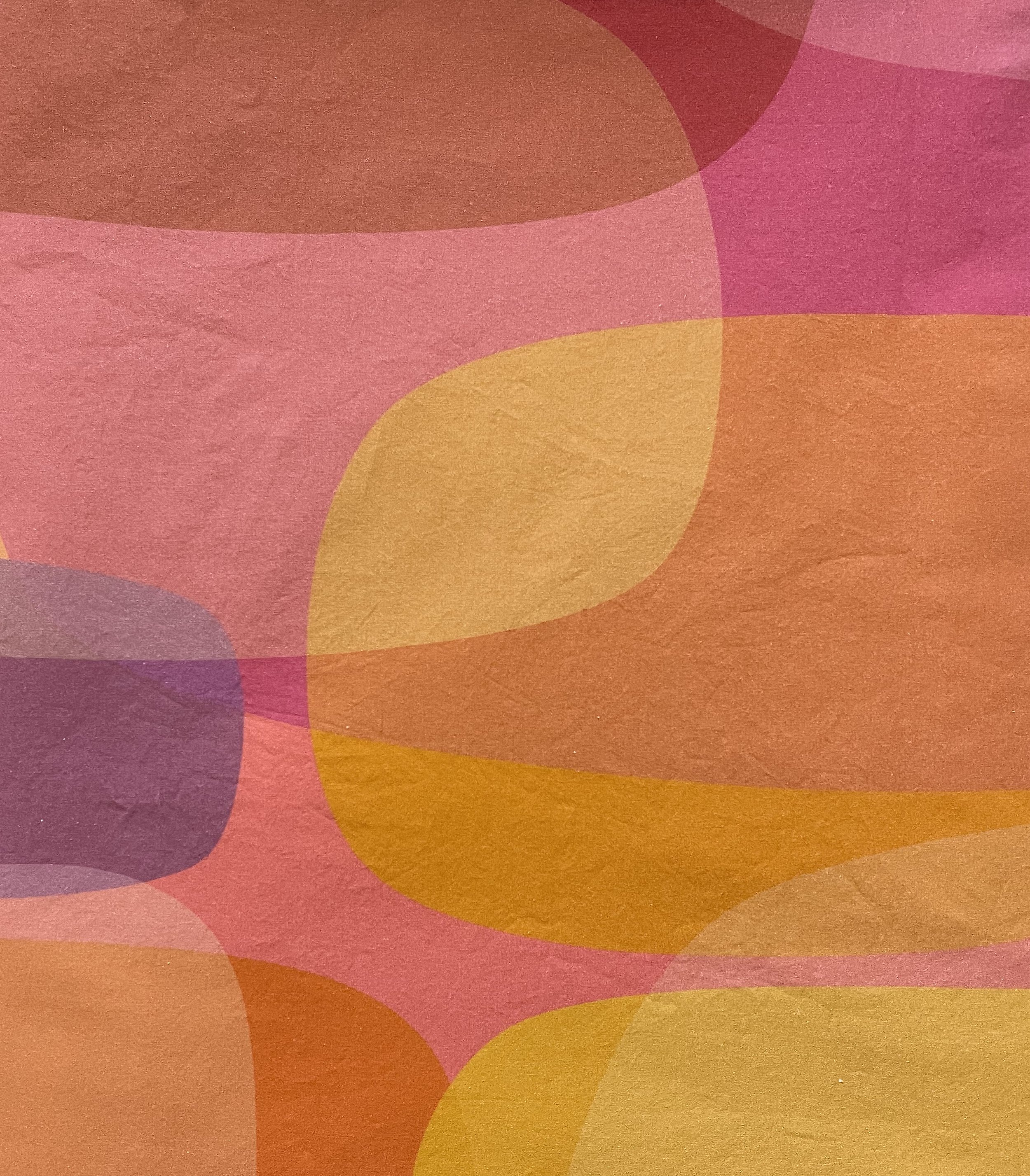
Biome was an experiment to see if figure/ground, subtractive area experiments could be a basis for a typeface. The process of resolving that experimental idea is documented here on the I Love Typography blog. The original design had a number of alternates, as a result of the ambiguous and reductive shapes, but the commercial release through Monotype simplified the design and included the most conventional forms. I've always thought of it as a retro-futuristic typeface; it's trying so hard to be part of the future, but it clearly has some mid-century modern baggage it's bringing along. Three widths and seven weights allow plenty of expressive range. Because it's spaced more loosely than a typical "futuristic" typeface, it works surprisingly well at text sizes. In 2022, exploring ideas for textile patterns, I returned to the core concept of overlapping ovoid shapes, and the background art for the specimens found a new life in the textile design Ovoid Bubbles.
Biome