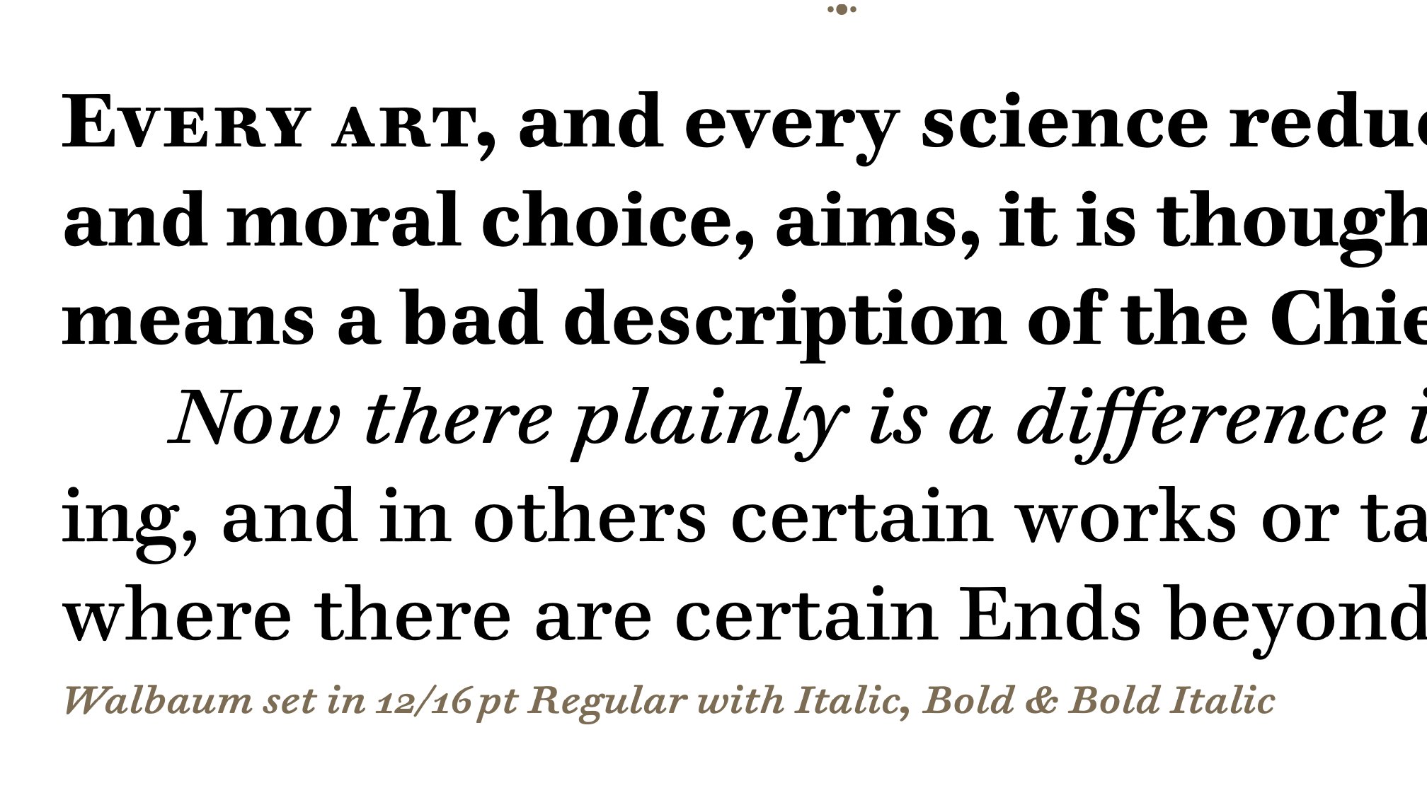
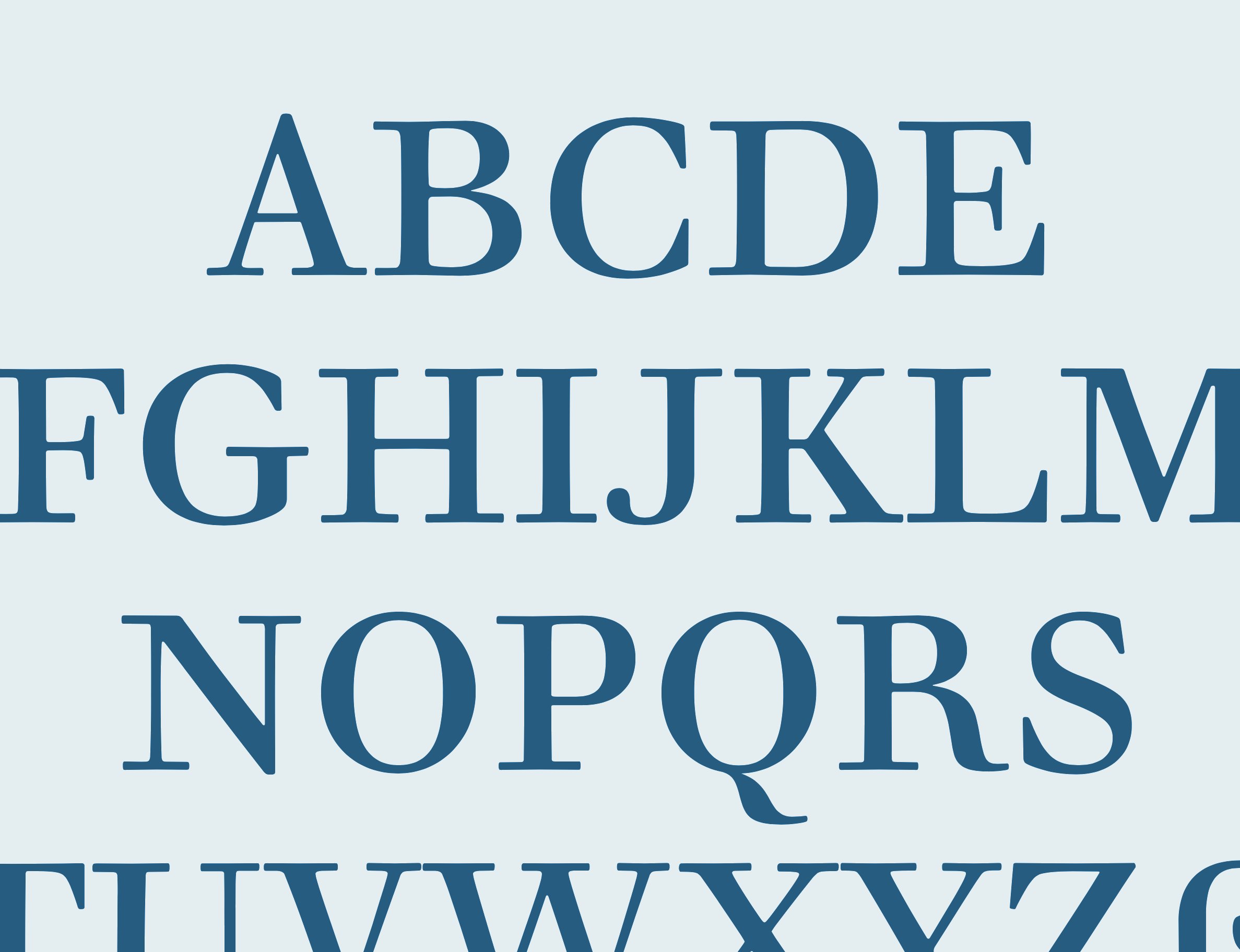
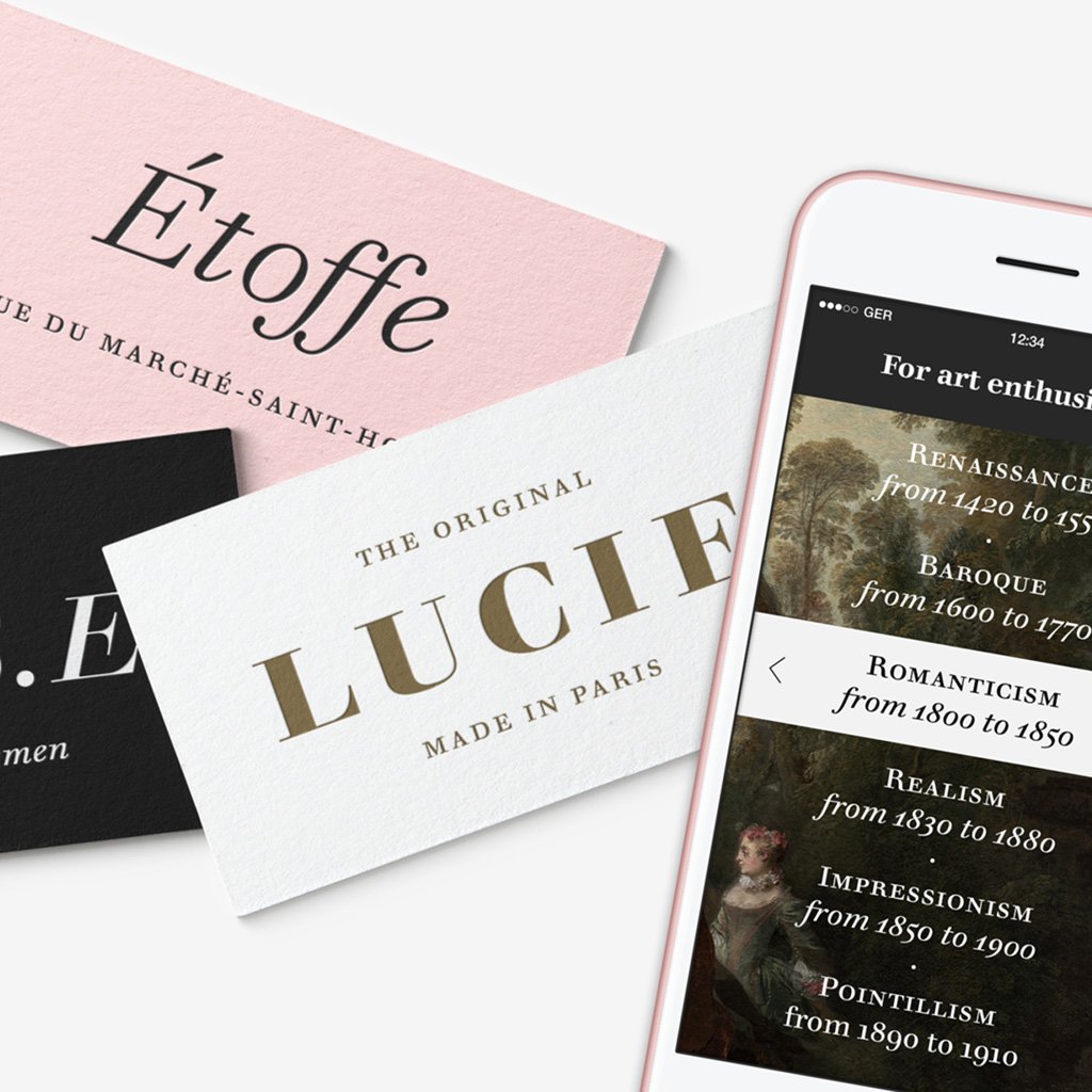
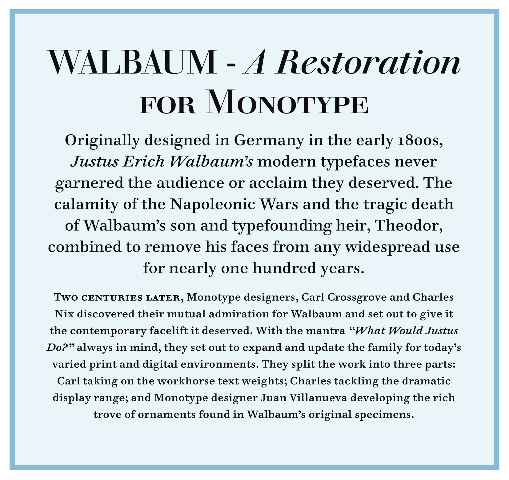
Monotype colleague Charles Nix and I discovered a common affection for the typeface Walbaum, while also despairing its fate as also-ran in the Modern serif type classification. Bodoni had been revived by everyone, and Didot was a refined favorite competitor, whereas Walbaum had had a meager presentation and then was nearly forgotten. But its charms and strength were undeniable. A cult classic, to letterpress printers and Monotype metal enthusiasts. Eventually half the Monotype Studio was involved in drawing ornaments, black poster weights, decorative styles and the rest of the production effort to refurbish and genuinely restore and re-introduce Walbaum to the audience of today. The wonderful blend of the 18th-century modernism and the healthy attention to comfort and legibility is retained in text styles (my main effort) and in a range of optical sizes drawn closely from original specimens. Going back to the originals while carefully adapting the work to our times allowed us to get the best of Walbaum's work for book and display typography in our digital age.
Walbaum