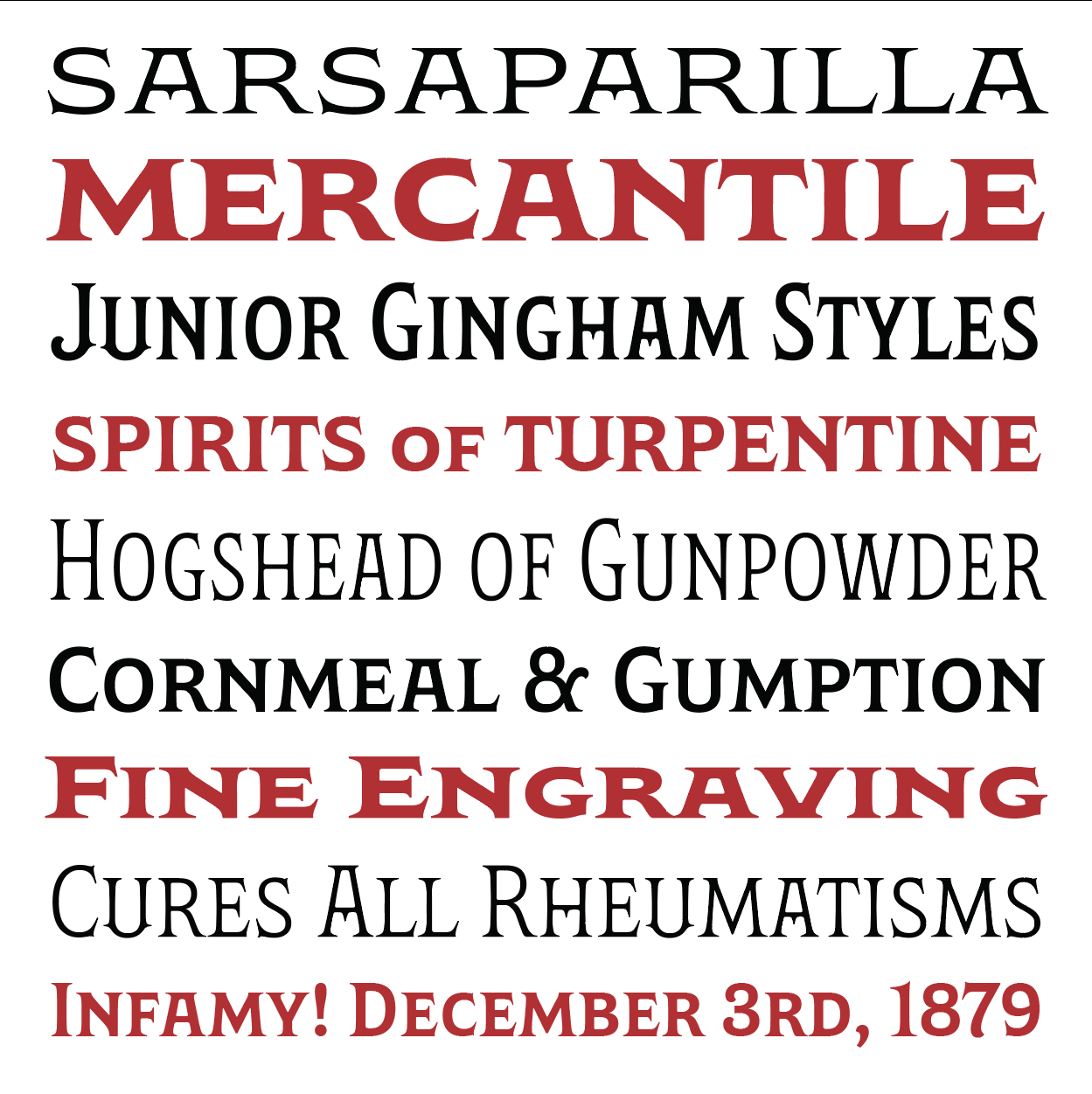
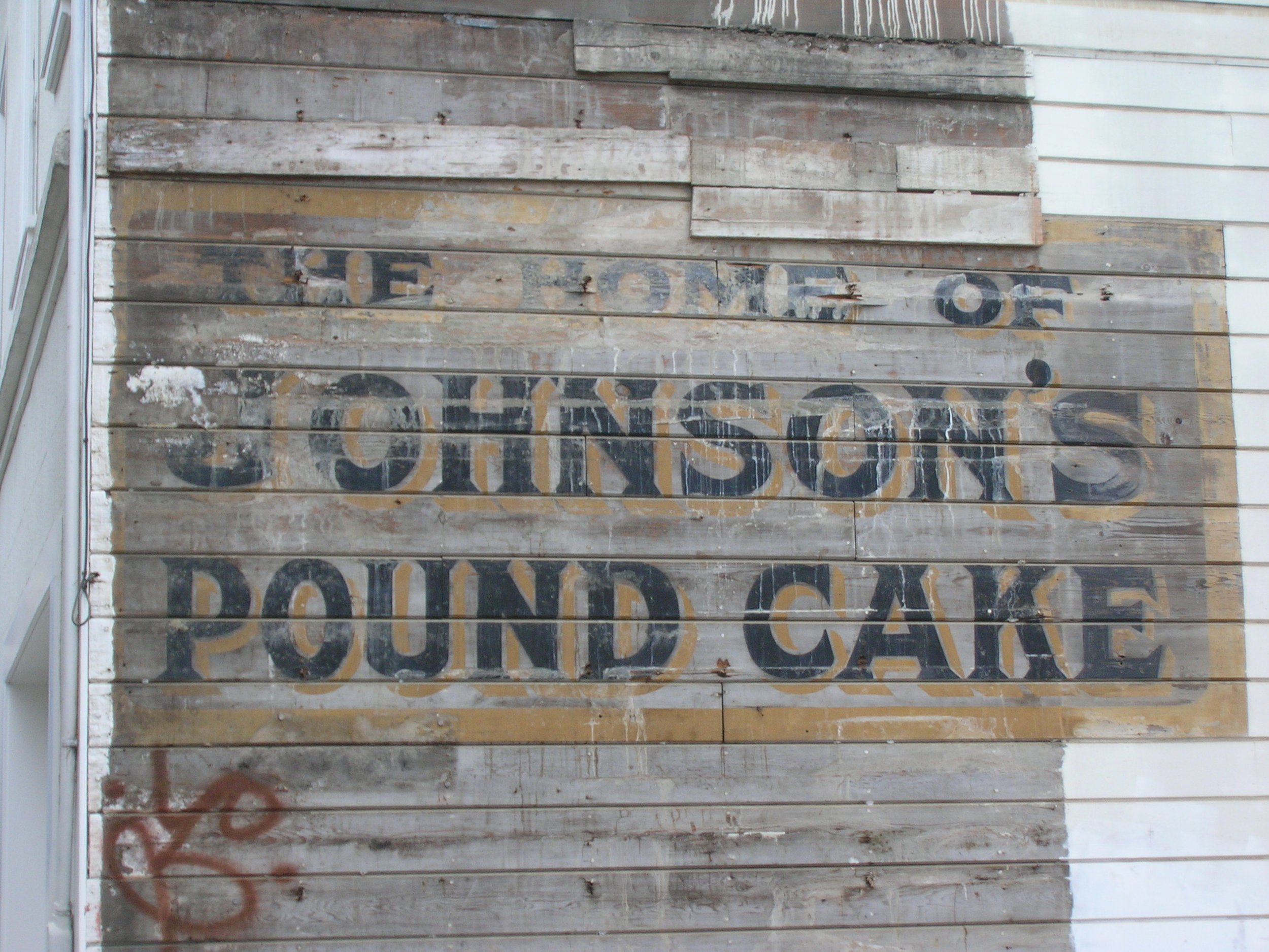
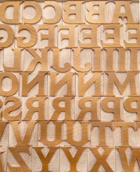
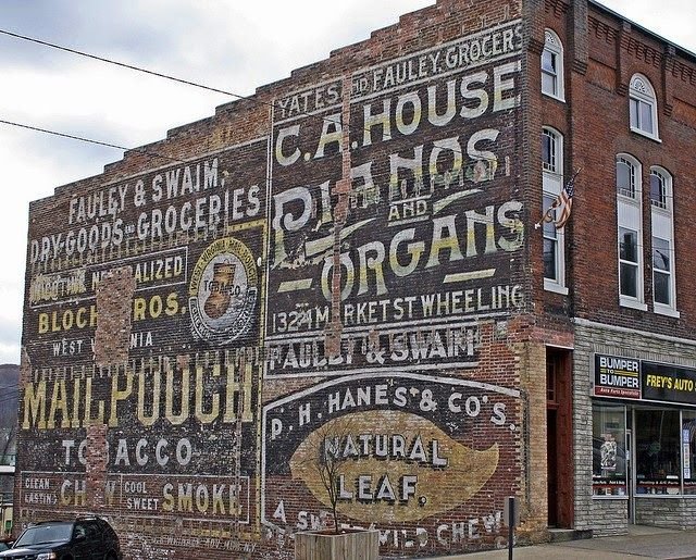
Evocative old photographs of city scenes in the United States show commercial zones in bustling neighborhoods just bristling with signage. The lettering styles and layouts are delights of composition and of carnival-barker brashness. With the same variety as large printed posters and advertisements, lettering was used in every size, weight and width to express commercial entreaties. I have noticed in ghost signs, old painted wood signs and photos, a whole complex of hand-painted lettering with a similar set of characteristics: Elegant Victorian proportions, long, bracketed serifs, and a mostly low-contrast structure. It is a style that adapts well to a large variety of weights and widths. Starting with a wider variant, I built out a large design space with the long elegant serifs and quaint forms in order to capture this style for our own time, but in digitizing these letterforms, something else happened; this style that is almost never used in sign-painting anymore has come around to be very much desired for period typography. Wakerobin puts the entire range of a signpainter's skills into a digital file you can use at any size. And from that came a surprise: It performs surprisingly well at quite small sizes, due to its low contrast, and without a lowercase. At 8, 9, 10 point, it tends to resemble our old favorite, Goudy's classic Copperplate Gothic. So Wakerobin has two roles it can excel at, for very different purposes. Regular fonts are available in 3 widths and 5 weights, and the Variable font gives you the whole infinite range of the design. Virgin Wood Type, in Rochester NY, has adapted one Bold style of Wakerobin and cut it in hard end-grain maple in two sizes of wood type.
Wakerobin