Ornament Alphabet experiments
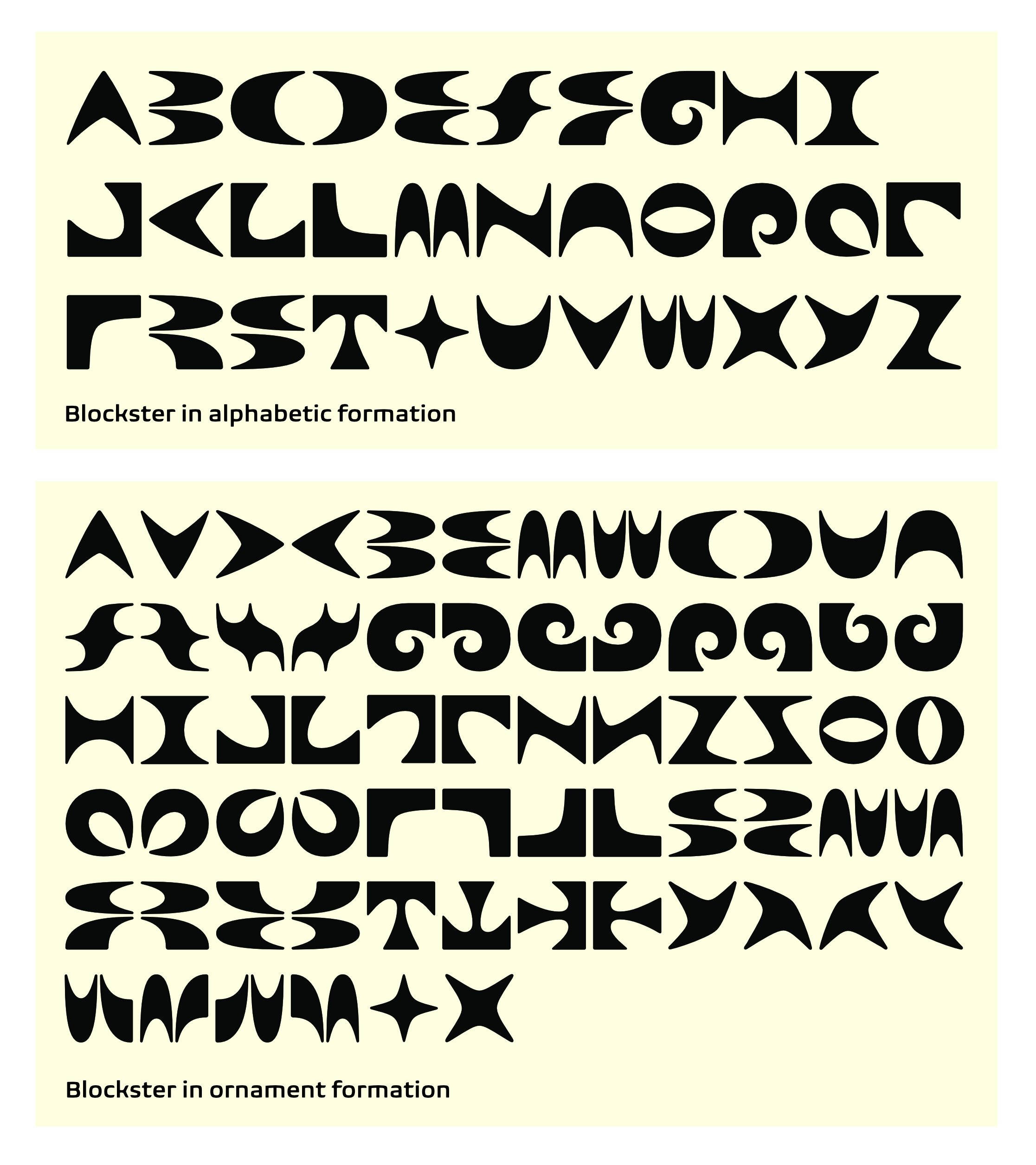
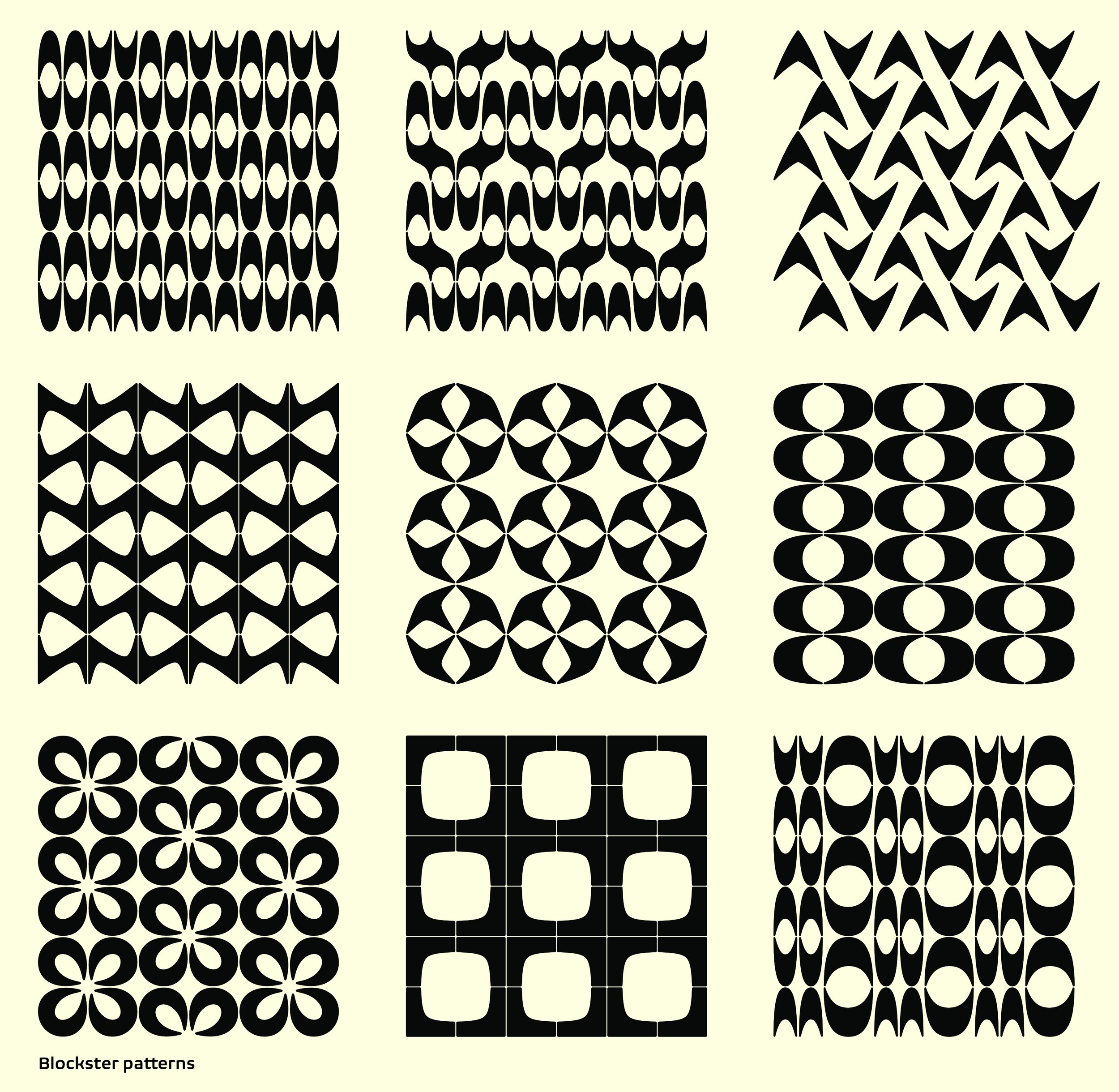
As a typeface designer, I am always thinking about interchangeable modular systems, which probably explains my interest in tile. Or maybe my consistent interest in tesselation is the seed of my interest in type? In any case, I found myself sketching letterforms that could be reduced to such abstract, symmetrical forms, that they could operate both as ornaments or pattern elements, and also as letterforms, at the outer reaches of legibility. This alphabet and the tile experiments that grew out from it are still in process. With a system of 15 or so shapes, a whole alphabet can be made, and also nearly infinite patterns. I've made some test patterns using the shapes, which are only a start at exploring all the possible combinations.
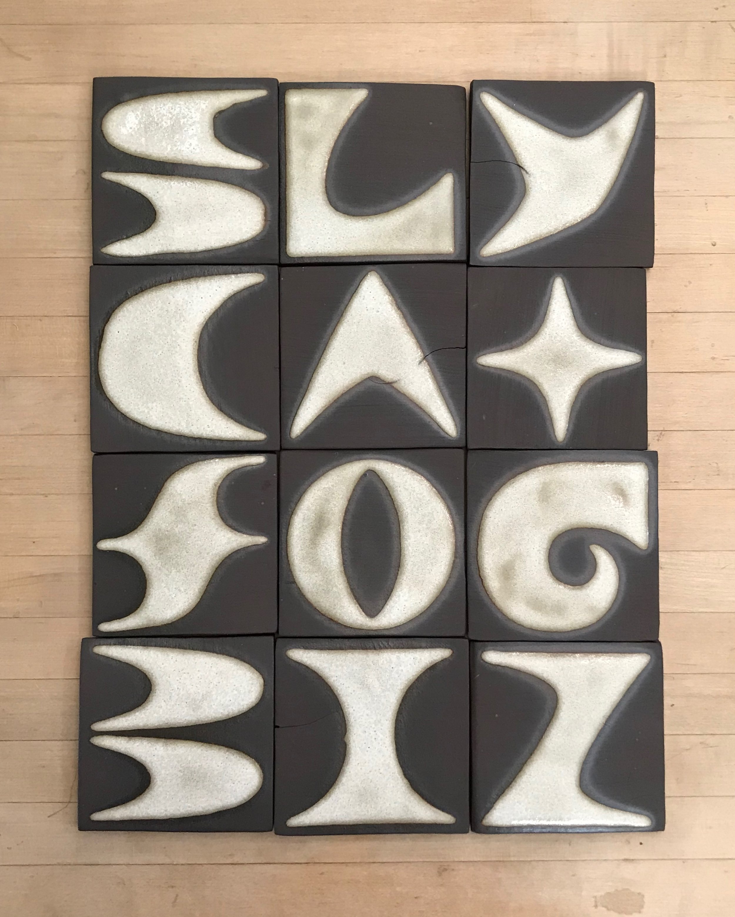
The relief version of the alphabet is less well-considered; I have seen relief tiles in a more geometric style that resolve as letters, but my design seems to demand some softness and curve. A few different clay colors, glazes and surface treatments show interesting possibilities, but one of the most interesting was slip-casting. I thought it could be interesting to pour thin layers of slips in the molds, then shave them down to reveal the layers. Then I thought, what if the outer layer is opaque, and the inner layer is translucent? So there are some tests that make a sort of lighted house number/letter from the relief molds. I want to do more experiments with that idea. Maybe the lighted numbers can be un-coupled from the abstract modular letterforms. Maybe there are other, more subtle ways to carve or erode the porcelain layers. More experiments await....
Ornament Alphabet Experiments