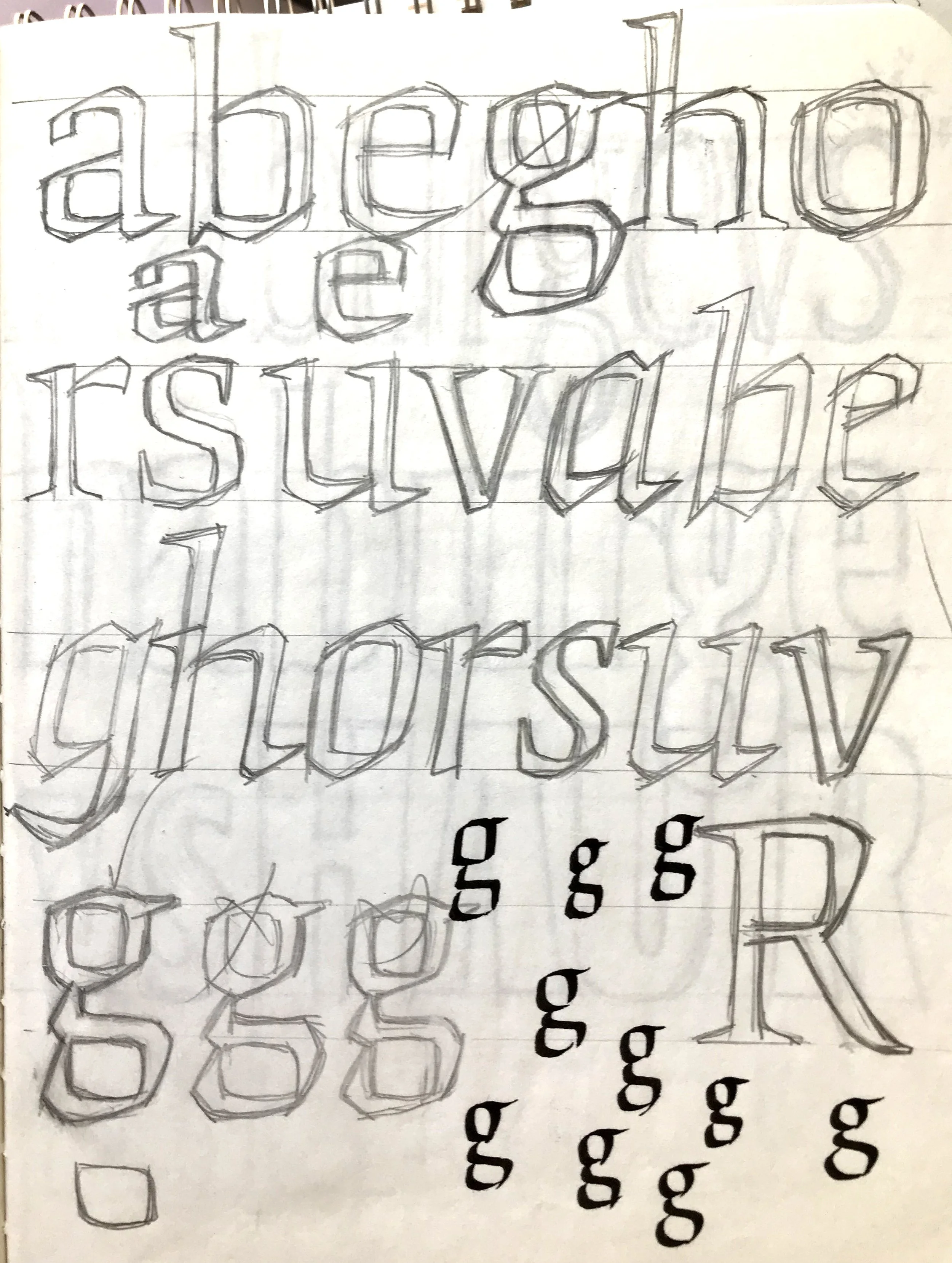
At a time when I was discovering a world of design, industry and variety in the typographic world in my first years at RIT, I came upon the work of Oldrich Menhart, Vojtech Preissig, Karel Dyrink and other Czech type designers of the early 20th century. The expressiveness and vigor of their work impressed me and I absorbed some of this angular, rigid treatment in new designs I was drawing. Again as an experiment, I looked for a way to use some kind of rectangular grid to draw what were essentially renaissance forms. These experiments can go very badly when doctrinaire rules are enforced, so some improvisation, softness, and calligraphic vocabulary was mixed in. Both roman and italic use a similar treatment while maintaining fairly conventional renaissance roman and chancery italic shapes. A display design in 4 weights, it still works as an expressive way to convey emphatic and athletic messages. Fonts available at FontShop.
Origami

