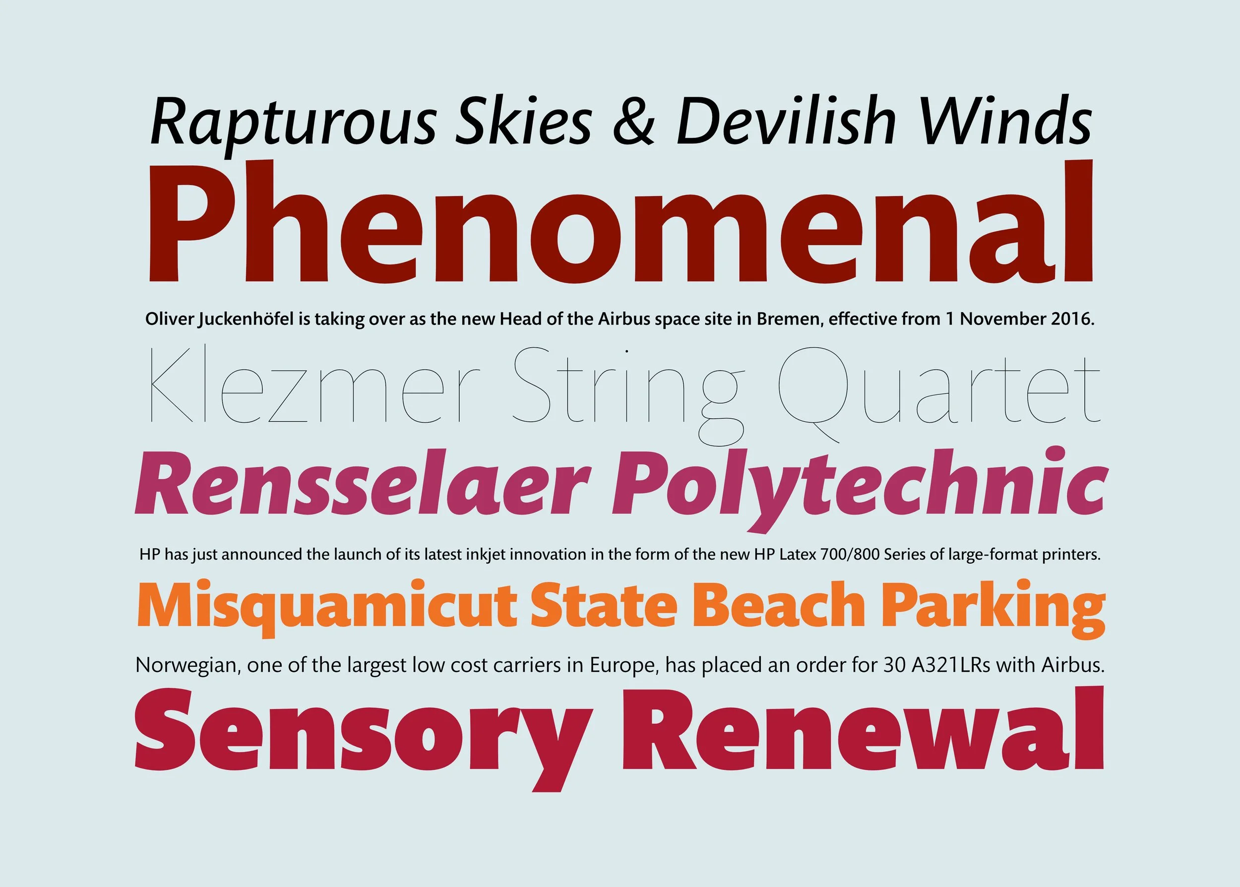
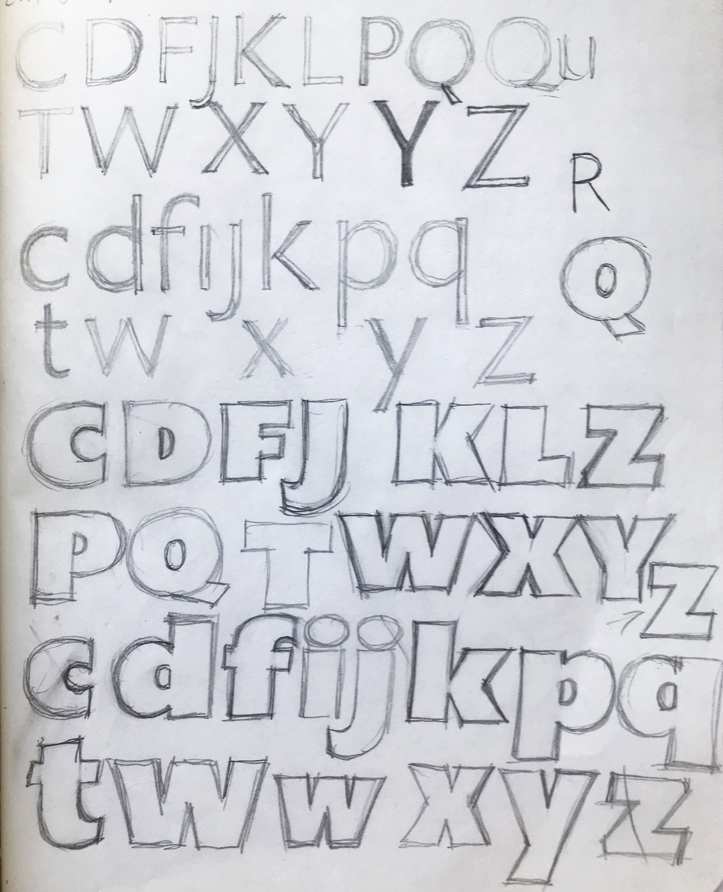
I started the drawings for this design in my first year of classes at RIT. I tend to sketch and re-draw things as a way to develop them, and Mundo Sans took a long time to resolve. I knew I wanted a humanist sans, which at the time, was not as common. I was looking at a number of typefaces which all tried to achieve the ideals of a humanist sans, but which I thought had flaws: too stiff, too uneven, strange, distracting features, too stylized, too monoline. Gill Sans, Syntax, Metro and Formata were some of the prominent examples I was seeing a lot of then (around 1991). One thing I missed in the existing options was a clearly humanistic and sensitive italic companion to the roman. Those had been even less often attempted. And following the trend of the time, the family had to have a large range of weights. I released Mundo first on Flashline (long-defunct online font store), then on its successor Makambo, and then as a library release by Monotype. By 2017, apparently it didn't have enough weights, so I added another 3. Mundo Sans makes a robust companion or counterpoint to serifed text faces like Bembo, Minion, Galliard, Dante and Garamond, since it includes small caps and a variety of number styles. Obviously the perfect companion to Mundo Sans is Mundo Serif.
Mundo Sans