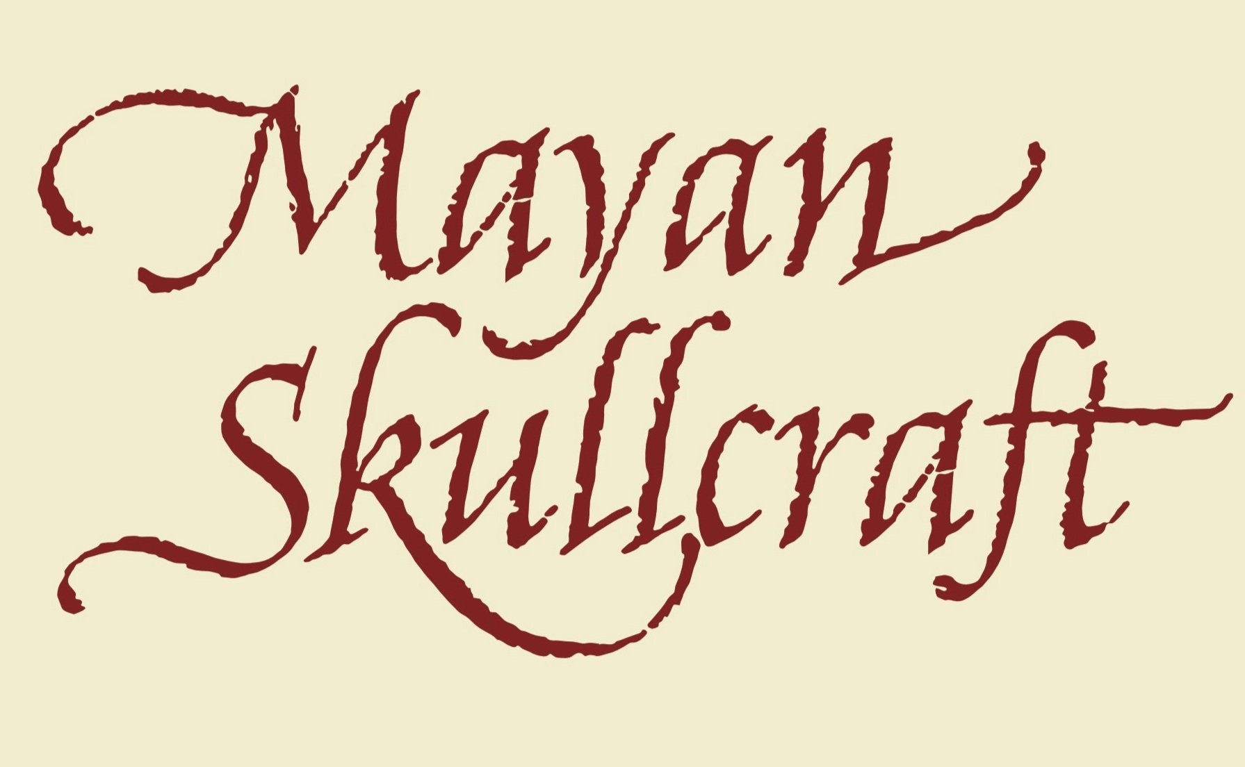
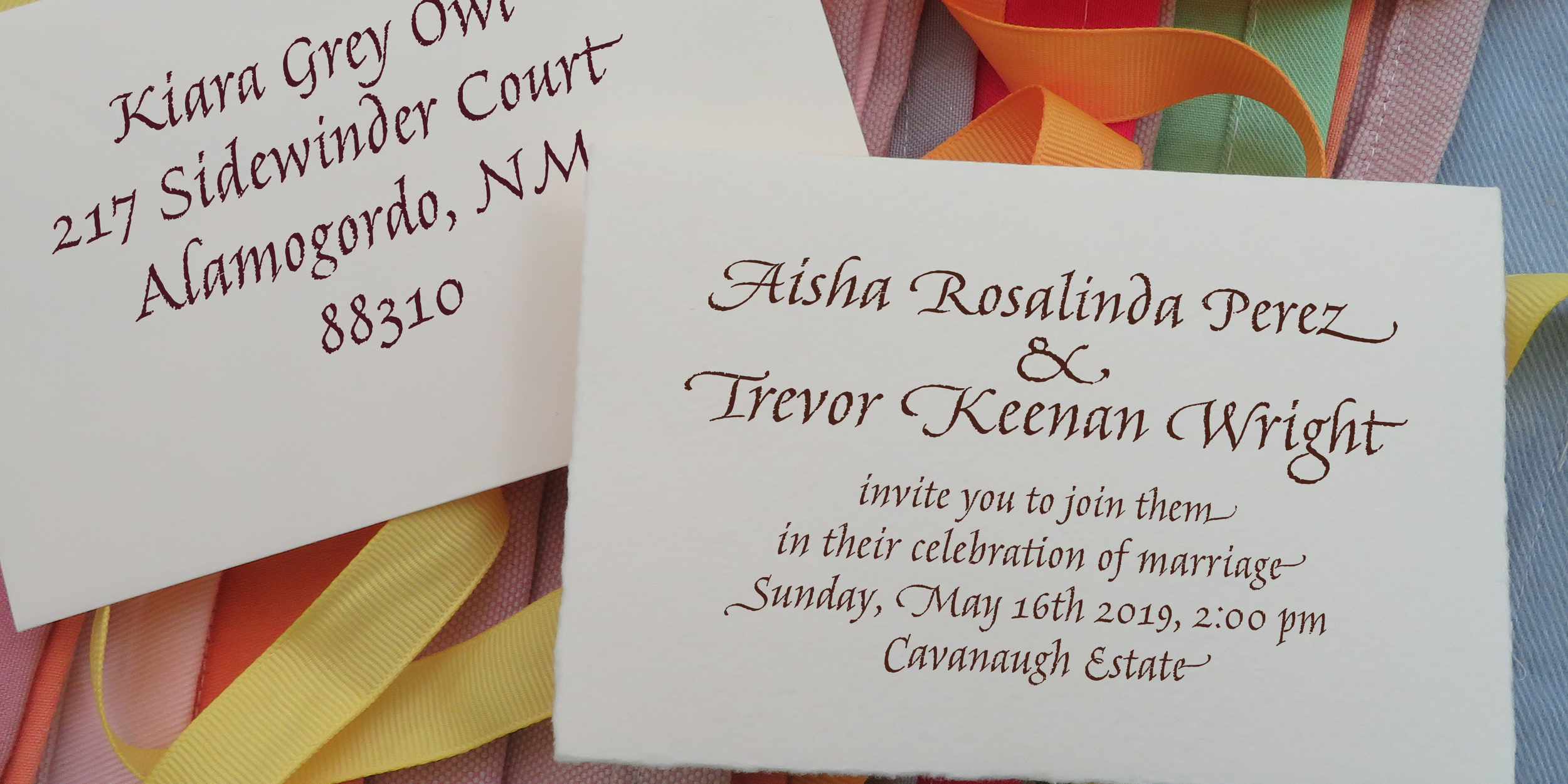
There is a range of "italic" typefaces available which derive from chancery italic and the marvelous traditions of the writing masters of the renaissance. Some are glossy smooth, some seem wood-cut, some seem digital. I felt like the more textural, written-on-parchment feel was the missing element. I hand-wrote dozens of pages, with the same pen, on rough watercolor paper, to give all the original work the same texture. Then after selecting and sorting through all the lettering, and a lot of auto-tracing, I assembled a digital type with alternates, double-letters, ligatures, swashes and 3 different styles of capital letters to produce effects not unlike rough hand-written italic. Automation in the font software prevents repeated shapes, and OpenType features enable a range of exuberance to be applied where needed. Amarone can be used at modest sizes like 18 and 24 point, but it tends to show its rugged texture nicely when set larger. Swash caps and alternates allow for some very piratical, mysterious and creepy expression.
Amarone